The Making of a Cookbook
Illustrations and Design
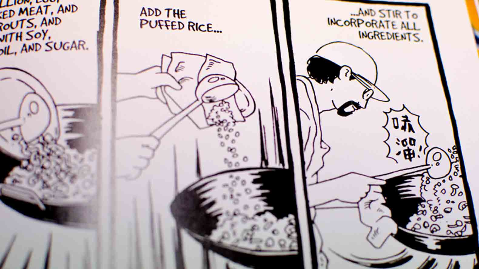
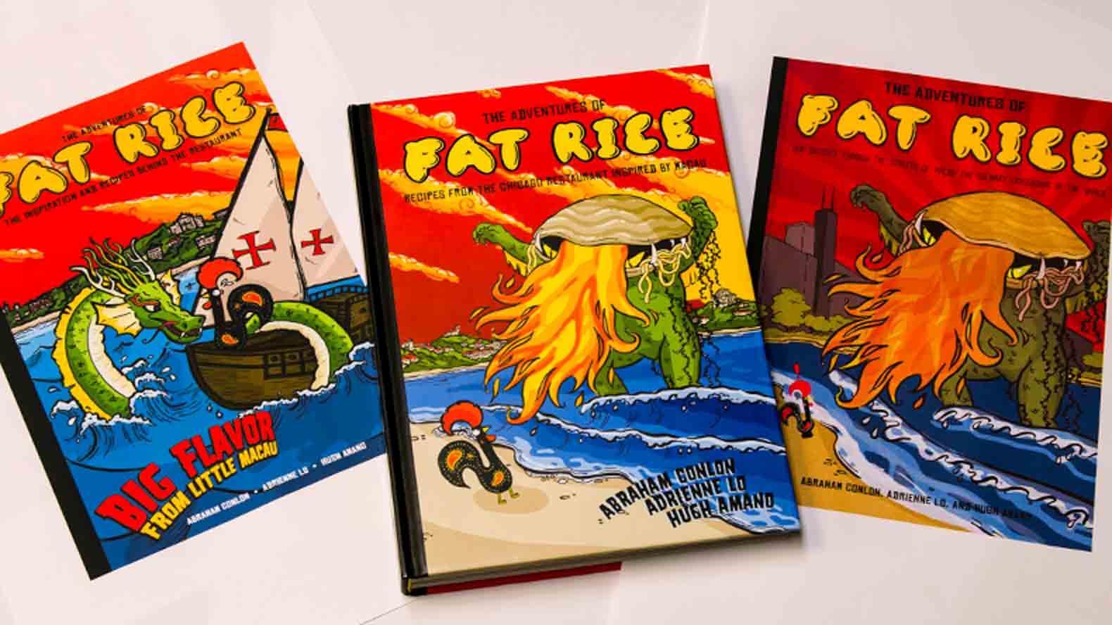
Once the manuscript was in draft form, and the photography was completed, it was time for Plikaitis to pull all the various elements together and design the book, and do it well. She wanted the book to be as important design-wise as it was food-wise.
“There was this New York Times article about how graphic novels were becoming the new cookbooks, so that was in our favor,” she says. “I wanted it to be this thing you want on your coffee table, so it had to have beautiful design.”
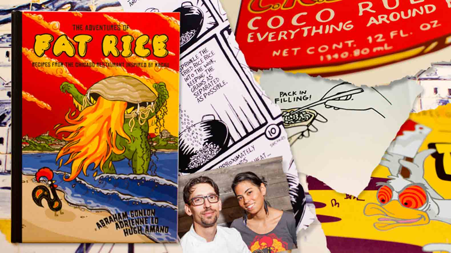
The photos weren’t the only visual pieces to consider. Illustration has been a big part of Fat Rice’s identity almost from the very beginning, ever since Chicago illustrator Sarah Becan started working with Conlon and Lo shortly after the restaurant opened.
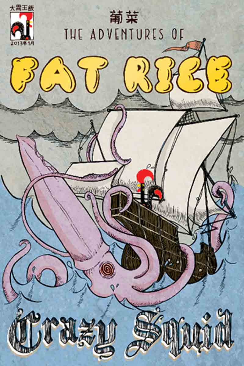
One of Becan's posters for the book.
“My boyfriend and I went there for dinner shortly after they opened,” Becan recalls. “One of the things we ate was the Portuguese chicken dish, with coconut-crusted chicken, mussels and Spanish chorizo. It was this amazing revelation to me that this dish I'd never had before—with a spice profile I had never had before—tasted so much like comfort food. I knew I wanted to draw it. I was posting regularly on a web comic blog I’d started, called Sauceome.com, and would draw about whatever cool, interesting meal I had just eaten. It was a food diary that was also about the social and personal issues about food. So I posted it, and a couple of weeks later, Abe contacted me, and asked if I wanted to do some work for them.”
Becan and Conlon met, and she began drawing posters for the restaurant, which serve as the restaurant’s only signage. “Abe will have a new dish on the menu, he’ll want to promote it, and he usually has a pretty cool, clear idea of what he want to do,” she says. “Like when they were doing the dry-fried asparagus for the first time, he was like, ‘They look like little green Martian aliens!’ so we had the idea to draw them as aliens, with black, cavernous eyes, and UFOs in the background.”
When it came time to do the book, Becan’s drawings were a big part of the proposal, and later, the design plan. They work in tandem with the writing to establish a voice for the book, one that was serious about the content, but wants to make sure we are all having fun along the way.
“Having the bubble letters, the monster, the rooster, all the graphic stuff, it doesn’t necessarily prepare you for what’s inside, but it makes you not intimidated by it. There might be this historical story, all these unfamiliar ingredients and weird stuff, but at the end of the day, it’s fun and it’s delicious.”
Abe Conlon, Fat Rice
“Having the bubble letters, the monster, the rooster, all the graphic stuff, it doesn’t necessarily prepare you for what’s inside, but it makes you not intimidated by it,” Conlon says. “There might be this historical story, all these unfamiliar ingredients and weird stuff, but at the end of the day, it’s fun and it’s delicious. Sarah’s illustrations are a big part of the restaurant and of the cookbook.”
Conlon, Becan and Plikaitis worked together on the design.
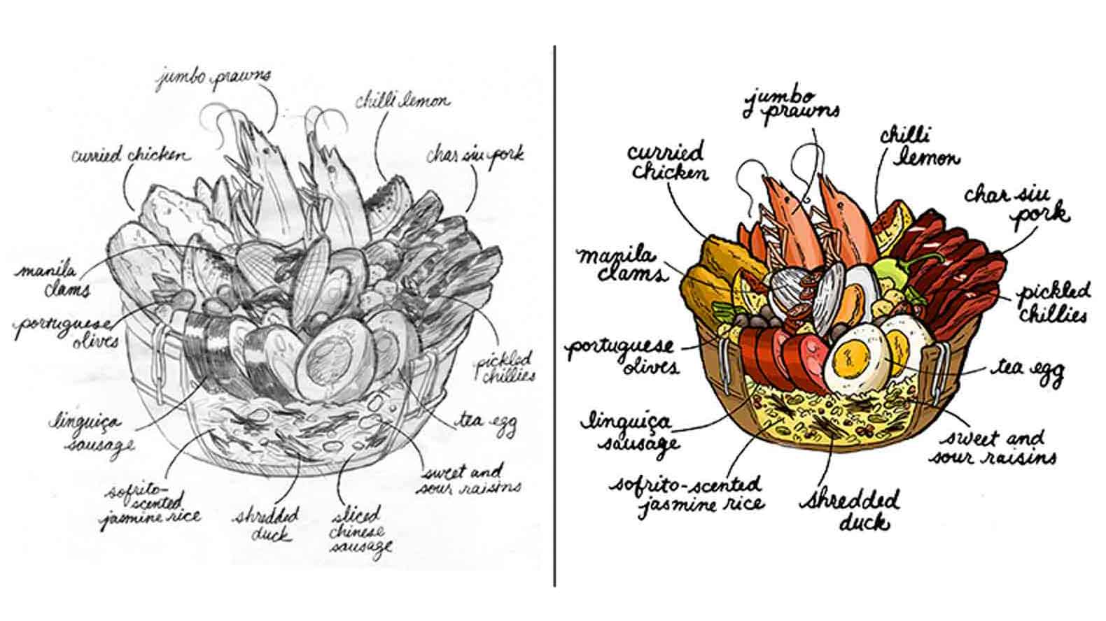
Becan's drawing of Fat Rice's arroz gordo dish.
“Sarah is a bad ass; she’s a superstar,” Plikaitis says. “It was so much fun to work with her. Certain illustrators are very protective and don’t want to collaborate, but she was totally open to it. It was awesome that I could send her things, and be like, ‘Hey, how about this?’ It was really nice to work with someone so intimate with the brand and tag-team.”
For Conlon, who had strong ideas about the book’s design, the illustrations were a needed counterpart to Goldberg’s gritty, not-always-pretty photos.
"The opening of the poultry chapter is of two dead chickens with their necks tied together,” he says. “It’s beautiful in its own right; that’s what’s real. That contrast with the pop imagery that Sarah has done is another exercise in the contrasting elements that make up what Fat Rice is. It’s olive oil and soy sauce. It’s curry and sausage. It’s these things that aren’t supposed to go together, but do in a right way.”
Becan went on to create different types of images for the book, including posters from the restaurant to illustrate various dishes, line drawings to demonstrate cooking techniques, and little extras throughout. The comics that demonstrated how to cook something were called wok comics, while the drawings showing hands doing something are called Thing Things.
“We were sitting there, me and Abe and Hugh talking about the hand, and I thought we were talking about the Addams Family,” Lo says. “We were like, we just want the hand, like Thing from Addams Family.”
Conlon adds, “And we were like, what are we going to call these things? Thing Things!”
The drawings went a long way towards making the book’s complicated recipes relatable to home cooks, and Becan took them seriously.
“For the instructional comics, that was very much the chefs showing me the process, and me trying to show the clearest way for people who were not chefs,” Becan says. “A lot of times I would watch one of the chefs make a dish, take a million photos so I could convey the process as clearly as possible.”
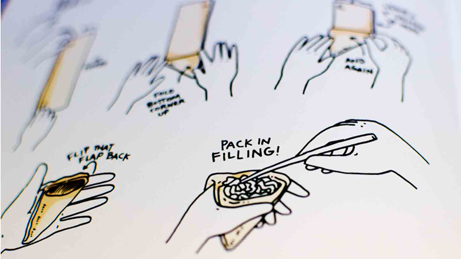
One of the "Thing Things" Becan drew for the book.
Spotting the Easter Eggs
One of the best things about The Adventures of Fat Rice is how enjoyable it is to just flip through the pages and look at everything. And it’s even more fun if you know to look for pop culture references. Start on page 258, where the chilli lemon drawing will stand out to anyone who is a fan of late-'60s avant-garde rock music.
“Abe wanted it to look like that album cover of The Velvet Underground that Andy Warhol did, with the banana on it,” Becan says. "We used the same typography from the album.”
The posters throughout the book also reference the team’s favorite movies and music.
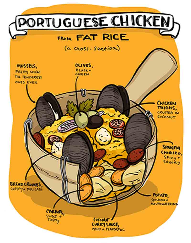
Becan's first drawing about Fat Rice
“We were sticking with mediums: Comic covers, movie posters, album covers, these things we know as iconic, shifted a little bit to fit with a Fat Rice twist,” Becan says. “We didn’t necessarily say it; we wanted to let people go, ‘Oh, shit.’”
And so, the diablo devil’s curry poster is based on the movie poster from Reefer Madness. The dry-fried asparagus is based on the Invasion of the Body Snatchers. And the porco balichang tamarindo references The Creature from the Black Lagoon.
“We used the pig a couple of times,” Becan says. “There a bit of Studio Ghibli fandom in that, since I’m a big fan of [Hayao] Miyazaki films as well. [The movie] Porco Rosso seems like a good inspiration for a restaurant poster.”
“Utilizing pop culture imagery gives people comfort and draws them in,” Conlon says. “It’s really subtle; they are almost subliminal in a way”
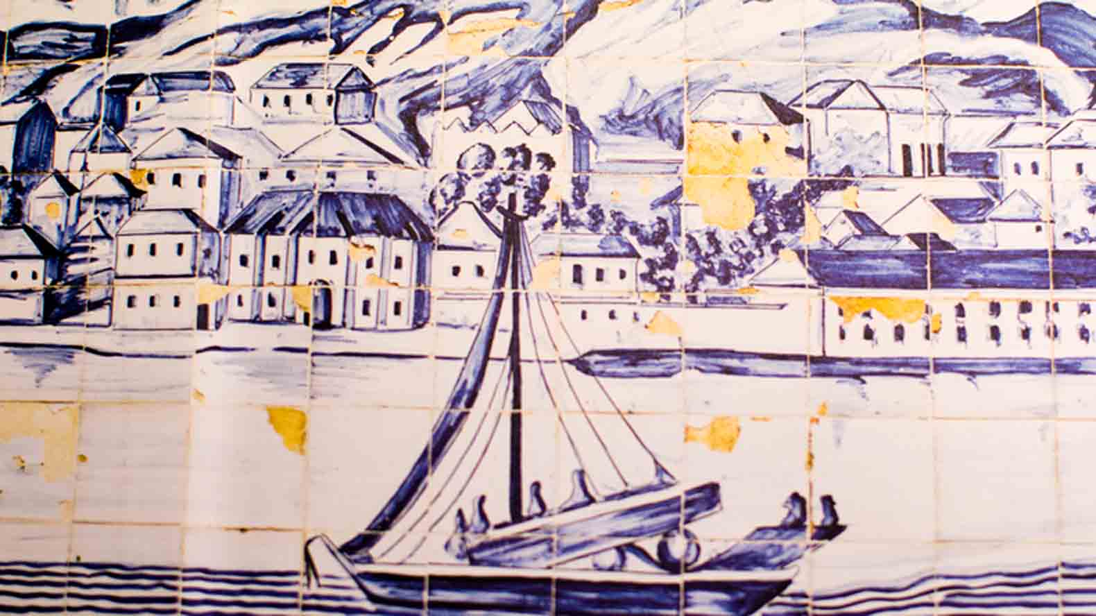
Classic Portuguese tiles from the book's endpapers Photo: Dan Goldberg
About the Galo
Flitting throughout the book is a little rooster, who is actually the galo de Barcelos, the unofficial mascot of Portugal. “Where the Portuguese have been, so has the galo,” Conlon laughs. The galo is basically a character in the book, who doesn’t have a speaking part. But he’s pretty important: He’s Fat Rice, having all the adventures.
“This was a book about the journey that the restaurant has taken, that we have taken,” Lo says. “It makes you wonder where Fat Rice is going next.”
“This was a book about the journey that the restaurant has taken, that we have taken. It makes you wonder where Fat Rice is going next.”
Adrienne Lo, Fat Rice
“The Adventures of Fat Rice is like The Adventures of Tintin," Conlon says. "You have this little character, the galo, getting himself into precarious situations, like Scooby Doo or Donald Duck.”
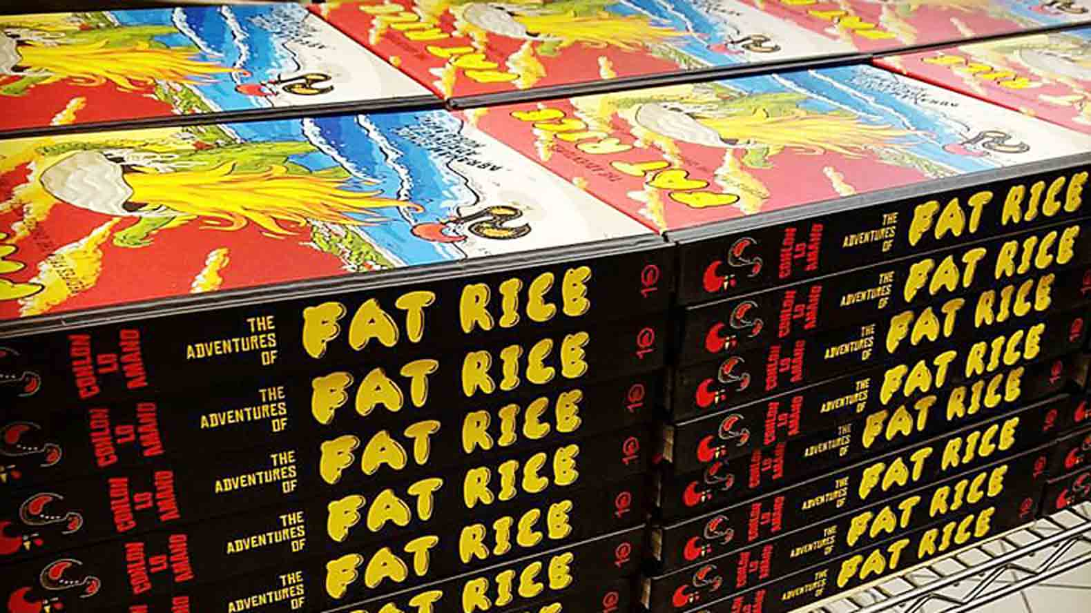
“The galo is their mascot,” Plikaitis says. “We thought it would be really fun if we put the galo in different predicaments. So we worked with Abe and Sarah to put him throughout the book. I love that he looks like he’s in a black hoodie on the spine of the book; it's one of these little nuances you would never think of.”
Pulling Everything Together
Finally, Plikaitis had to pull all the text, the recipes, the photos, the illustrations, the galo, the vegetables at play and chilli clam getting ready to attack—everything—and figure out how to turn it into a book.
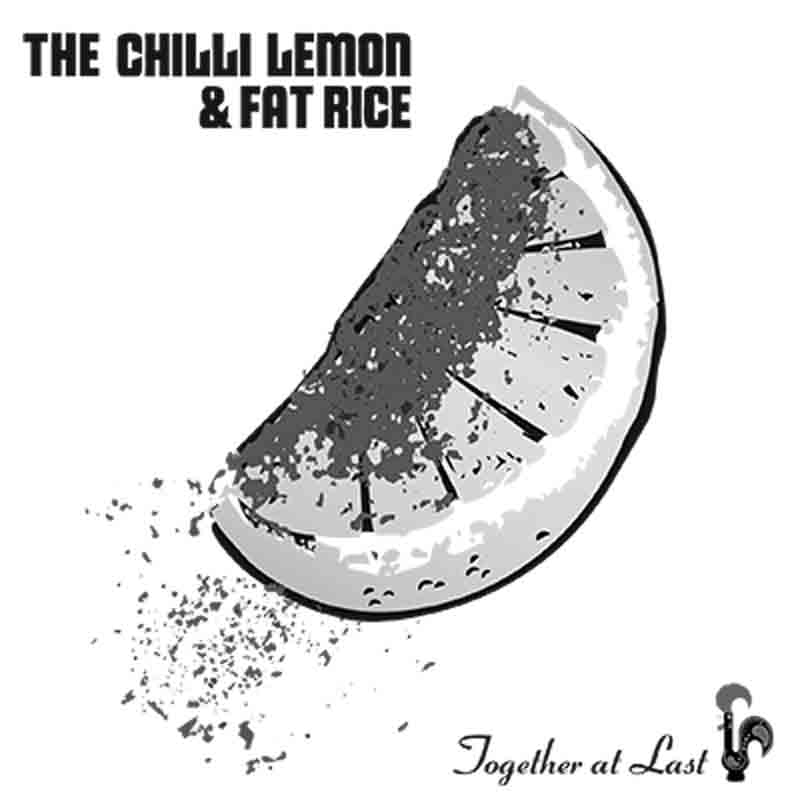
A Warhol-inspired illustration
“We do book-mapping, we figure out the shot list—how many food photos, the number for each chapter allocated based on word count,” she says. “We decide which recipe is going to take a [two-page] spread, and if my design fit in the space, or do I throw print over the images? Then you add in all the Macau images.”
Plikaitis went through hundreds of images from Macau, weaving them into the book, adjacent to recipes, in chapter introductions, and even unexpectedly, in the book’s endpapers.
“Dan took this photo of these old tiles, with a boat and the water,” she says. “I used it in the endpapers, to reference tradition, and to pick up the blue from cover. It’s transporting you to Macau. You have the saturation of the red on the cover, so to contrast, you want something a little subtle, and to pick up one of the colors—the blue.”
Even the font used for the text was carefully selected.
“You don’t want to the typeface to be too boring, so I picked a condensed strange font,” Plikaitis says. “I didn’t want it to be normal. I picked certain typefaces to merge with the posters, so it was fun and playful and really strong.” Next
More about the Making of a Cookbook
- Log in or register to post comments
